A Guide to Images in SvelteKit
| Published: January 23, 2024
| Updated: January 23, 2024
Images just got a whole lot better with SvelteKit! 🥳
The SvelteKit core team recently released the enhanced-img package, which automatically makes images in your SvelteKit app:
- Reformatted for web in
.avifand.webp, - Quicker to load,
- Automatically sized to suit the user’s device, and
- Able to be cached effectively
This means that your user is going to have a much better experience using your application, plus your SEO metrics will also thank you.
In this article, we’ll walk through how to best add images to your SvelteKit app (hint: it’s not using img tags), and the shortcomings of the enhanced-img package.
The 2 methods of handling Images
The 2 ways you can import images into your app are:
Import using Vite
This is the method that you’re probably used to. You would typically import and use an image in your markup like this:
import featureImage from '$lib/assets/feature-image.png'

<img src={featureImage} alt="The feature image" />
Using the standard import and img tag has been the go-to method until just before SvelteKit 2 was released.
It’s simple, and Vite does some automatic processing on the image to improve performance and caching. However, if you take performance seriously, you should steer away from this method as much as possible, in favor of the enhanced-img method.
Using the SvelteKit enhanced-img method
This is the preferred method that you should aim to use as much as possible in your application.
It uses a the @sveltejs/enhanced-img package, which was built on top of the Vite asset handling system, and provides a bunch of extra features to improve your application.
It’s currently experimental which means for every minor release, there may be breaking changes. If you’re running mission-critical software with SvelteKit then perhaps it’s safer to stick with Vite imports.
We’re going to spend the rest of this article talking about the @sveltejs/enhanced-img package, as it’s the primary way most projects should be handling your static images.
The SvelteKit enhanced-img package
The SvelteKit development team have addressed the concern of images and delivered a package that handles most of the optimizations for you at build time.
The process to use enhanced-img is simple - you use it just like your standard img tag, but you prepend img with enhanced:, like this:
<enhanced:img src="/assets-route/image.jpg" alt="An optimized image" />What does it do?
The benefits you receive under the hood using enhanced-img are:
- Image processing which delivers smaller image sizes in
.avifor.webp, - Automatically sets the
widthandheight, which removes content layout shift (when your content moves down the page as your image loads), - Creates images of multiple sizes for different devices, and
- Strips EXIF data (metadata that is stored about the image, e.g. a digital camera attaches camera model, date/time, location etc.)
All of this is to say, your users will:
- Download less,
- Get faster experiences using your app,
- Get tailored images served for the size of their device,
- No content layout shift, so the experience won’t be janky and content will stay exactly where it was placed on page load,
- Your SEO scores will level up massively, which means you might start getting more traffic!
If all this ☝️ doesn’t sell the @sveltejs/enhanced-img library to you, I don’t know what will!
If you’re coming from React world, this library is the SvelteKit flavor of Next.js’s <Image /> component. Although the SvelteKit package is even better, as it automatically sizes the image for you, whereas next-image requires you to manually set both width and height.
If you’re a SvelteKit developer, consider yourself lucky. 🍀
So, let’s look at how to use enhanced-img in more detail.
Using enhanced-img
We’ll have to go through 3 steps to use the package:
- Install the package using npm/yarn/pnpm,
- Add the
enhancedImages()plugin to ourvite.config.ts, - Declare the
enhanced:imgin our markup
1. Installing @sveltejs/enhanced-img
First off, we’re going to need to install the package using this command in our terminal:
npm install --save-dev @sveltejs/enhanced-imgIf you use yarn or pnpm, use the following commands instead:
- Yarn:
yarn add @sveltejs/enhanced-img, or - pnpm:
pnpm add @sveltejs/enhanced-img
2. Add the enhancedImages() Plugin
In the vite.config.ts file in the root of your projects, you should have an exported defineConfig that looks something like this:
export default defineConfig({
	plugins: [sveltekit()]
});
We want to alter this by:
- Importing the package at the top of the file:
import { enhancedImages } from '@sveltejs/enhanced-img';, and - Adding it to the
pluginsarray, before thesveltekit()plugin.
The additions should look like this:
import { enhancedImages } from '@sveltejs/enhanced-img';

export default defineConfig({
	plugins: [enhancedImages(), sveltekit()]
});
3. Declare the enhanced:img in your markup
Remember: This only works for static images that are included at build time. See the shortcomings of
enhanced-imgfor more details.
Import your source images just as you would normally in your SvelteKit project, as it is done with the Vite asset handling. However, instead of:
<img src="{imageSrc}" alt="Image Alt" />Write:
<enhanced:img src="{imageSrc}" alt="Image Alt" />You don’t need to import anything additionally to the page - the plugin you added in the step before takes care of this.
You can even still add classes to your image as you would with a regular img tag.
Output of an enhanced-img
When you use an enhanced-img, the output that gets served to the user is very different.
Instead of the regular <img src='./image.png' />, the client is served a <picture> tag, which wraps up 3 <source /> tags and an <img /> tag, like this:
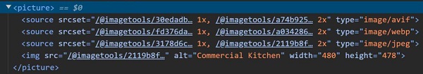
The 3 sources in the output are the multiple image types (
.avif,webpandjpeg) with the different sizes.
This is the output for this declaration:
<enhanced:img src="$lib/assets/images/commercial-kitchen.jpg" alt="Commercial Kitchen" />And the size of the image served is less than 10kb, where the original was 150kb.
Things that may trip you up
Dynamically using enhanced-img
We know that enhanced-img can only be used for static images which are available a build time, however unless an <enhanced:img /> directly references some image imported from Vite in its src, then it won’t be included in the bundle.
This means that if you use an <enhanced:img /> with a dynamic src, the image won’t work will be empty.
Let’s look at an example where this can happen in a loop.
<!-- ❌ This will not work ❌ -->

<script lang='ts'>
    import samImg from '$lib/assets/sam';
    import taylorImg from '$lib/assets/taylor';
    import markImg from '$lib/assets/mark';

    const employees = [
        { name: 'Sam Burns', image: samImg },
        { name: 'Taylor Layley', image: taylorImg },
        { name: 'Mark Bronson', image: markImg },
    ];

</script>

{#each employees as { name, image }}
    <a href={`/employees/${name}`}>
        <enhanced:img src={image} alt="" />
        <span>{name}</span>
    </a>
{/each}
When we look at the image declaration in the markup:
<enhanced:img src="{image}" />The src references image, which is a property of the looped object; not a direct reference to the image resource.
As it has no direct reference to an image resource, none of the images will be included in the bundle and therefore won’t be shown in this app.
So let’s look at how to fix this.
Fixing enhanced-img when using a dynamic src
If the images don’t show in your build, we can get around this by appending ?enhanced to the import path.
For example switch this:
// ❌ Don't do this
import samImg from '$lib/assets/sam';
with this:
// ✔ Do this
import samImg from '$lib/assets/sam?enhanced';
And then your imports will be included in the bundle, and will therefore work when pointing assigning a src attribute to an enhanced import dynamically.
Shortcomings of the enhanced-img package
Beyond the obvious fact that this package is currently experimental, there are a few scenarios where you don’t get the benefits of using it.
Given that it is built on top of Vite’s built-in asset handling, unfortunately the enhanced-img package only works with images that have been bundled at build time. This means that if people using your app are regularly uploading images which should get shown dynamically, using the enhanced-img package won’t be able to display them.
In this case, you’re best serving images from a separate database through a CDN (Content Delivery Network) and popping the source in a standard img tag like this:
<img src={`https://cdn.imageUrl.com/imageId`} alt='Image from a CDN' />So the rule is:
- If you know the images in your app before you deploy => serve them with the
enhanced-imgtag, - For user-generated uploads, have them upload the images to a storage bucket like Supabase or Amazon S3, and serve the CDN URL’s in a standard
<img />tag.
If you want the assistance of a library to deliver dynamic images with first-class support for Svelte and any CDN, then the Svelte team recommends Unpic-Img, however you’re generally fine with the plain img tag and CDN URL.
Additional Things to Know about enhanced:img
What we’ve covered so far should be everything you need to know most of the time, however if you want fine-grain control over images in your enhanced images, you can use these tips.
Change the size of your images manually
Whilst the package will automatically size the image for you based on its inferred dimensions, you can still optionally provide width and height.
Doing so will still prevent the content layout shift, however it can be useful to explicitly alter the size to suit your preferred UX.
You can also change the size with CSS in your style tags, like this:
<style>
    .logo img {
        width: var(--size);
        height: auto;
    }
</style>
In this example, you can use the var(--size) to automatically calculate the width for you. And this can obviously be done for height as well.
Image sizes and srcset
If the image you wish to use for your enhanced:img is large, and you want to defined the sizes it serves to particular devices, you can optionally set the sizes attribute.
Let’s use an example from the official SvelteKit docs.
Say you have an 1280px image that you want to take up the full width of the page, then you could declare this in your markup:
<enhanced:img src="./image.png" sizes="min(1280px, 100vw)" />What this says is:
Serve this 1280px-wide image at 100% of the viewport width of the device
And the build process will generate smaller images, and the srcset will be populated with those smaller images to fulfill this directive.
You can also be more granular about this, and tell the which size images you want to be served for any given device size.
You can do this by appending the difference width sizes to the img src with a w={widths}, (e.g. src="./image.png?w=1280;640;400").
But if you do this, you should also declare the sizes attribute by defining the device min-width, followed by the requested image width
For example:
<enhanced:img
	src="./image.png?w=1280;640;400"
	sizes="(min-width:1920px) 1280px, (min-width:1080px) 640px, (min-width:768px) 400px"
/>
Here, we can see:
- For the screen size with width above
768px(tablet): serve the400pxwidth image, - For the screen size with width above
1080px(tablet landscape): serve the640pxwidth image, - For the screen size with width above
1920px(desktop): server the1280pxwidth image,
Image Transformations
When declaring enhanced images, you can apply CSS transformations to them in the src declaration itself. This means that the served image will be transformed at the source, without CSS.
An example of this could be if you need to protect some image from being seen in full quality on the app, you can blur it at the source like this:
<enhanced:img src="./image.jpg?blur=15" />The available transformations follow JonasKruckenberg’s ‘imagetools’ directives. So if you go to the repo linked, you’ll see all of the transformations available to you.
The Priority Tag
You can add a priority attribute to the enhanced:img tag for the image you want to be loaded first.
This would generally be your hero image if you have one as it is the most important image for your user to see when they land on a page. It will also help your SEO, as the largest contentful paint (what your user sees above the fold) is prioritized.
Conclusion
Images can be a pain to deal with when you don’t have a tool like enhanced:img to help you out. Having to manually optimize images, and then provide manual dimensions, and cater it for devices of all shapes and sizes is a never-ending battle.
However, I’m extremely enthused about this package and the ability to have this all handled for us.
Whilst it’s currently experimental, it’s likely this will hit v1.0 over the coming months, and perhaps there will be some improvements along the way.
Hope this was helpful! ❤️